In Battle Chroniclers colors are the definition that controls how a unit or model is drawn. As well as specifying the color of each part of the unit, a Colors definition controls the label and symbol option to use.
Each army has a Colors definition. Each unit in the army uses its Army Colors, unless you define a special Colors definition for that unit. Each model in the unit uses the Colors of its unit. It is possible to give each special model its own individual Colors definition.
In the Army Definition dialog the Colors are displayed as a small icon. Next to that the button 'Edit Army Colors' gives access to the Colors Definition dialog.
Units and special models do not have their own Colors by default, so the 'Has own colors' checkbox has to be checked before the colors can be defined.
Whether defining Colors for an army, unit or model the same dialog 'Colors Definition' is used.
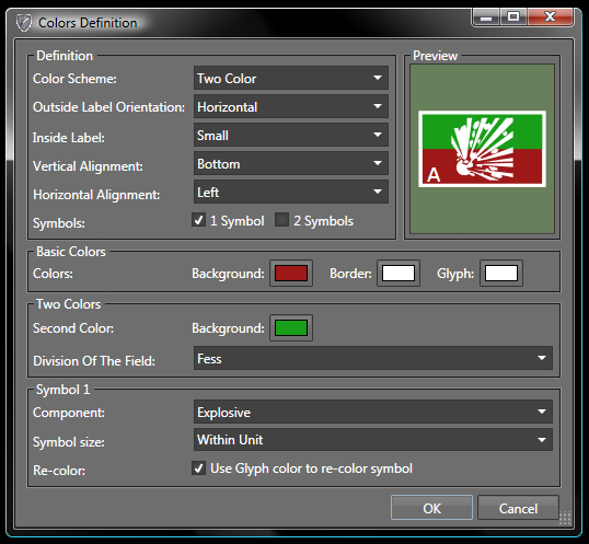
There are a lot of options on this dialog, but thanks to the preview section in the top right it is easy to play with different options to get the right one.
One important thing to note is that different options can be combined, such as a symbol and a label, as shown in the dialog screenshot.
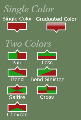
One or two symbols can be selected for the unit.
Symbols are special components that can be either vector or image based.
It is possible to define your own symbol components, this is discussed later.
Symbols are traditionally used in battle reports to show the type of unit. Battle Chronicler supports the standard military symbol set. By selecting more than one symbol it is possible to produce combinations for special troop types.
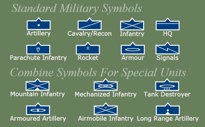
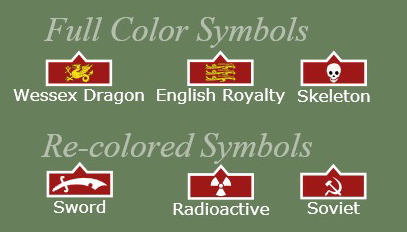
Vector components can be complicated multi-color designs which work well as symbols.
For simpler vector symbols it is best to re-color them to match the unit colors. In the example the bottom three symbols have been re-colored white to match the border.
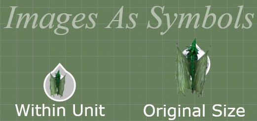
Images be resized to be drawn within the unit boundaries, the 'Within Unit' option.
Images can be displayed actual size, the 'Original Size' option.
In this case the image can overflow the unit boundaries. This is useful in cases where tank barrels, or knight's lances extend over the base of the unit.
Symbols are a type of component, like terrain and counters.
Symbol components are defined in the same way as other components.
Watch the Using Components screencast and read the Component creation walk through article for more details.
There are a few differences between Symbol and other component types, which are explained here.
The Level and Border parts of a component are not used for a symbol as these are defined by the units Colors.
Only Vector and Image types are used for symbols. The other types are covered by the units Colors.
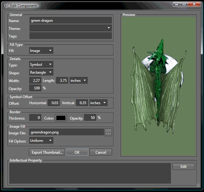
By default the image is drawn over the center of the unit. This can cause a problem with an image like the dragon in the screenshot below. The dragon's wings extend further below the base than the dragons nose extends above it. This means the center of the image is not the center of the base. So the dragon will not look right when drawn over the unit.
The Symbol Offset fields allow the image to be shifted so that it is correctly placed over the unit.